TITLE: MONASTERY
TYPE: WALLPAPERS / ART INSTALLATION / INSPIRING / DESIGN
YEAR: 2012
STATUS: REALIZED
CLIENT: 'T KLOOSTER COMMUNAL CITY BUILDING
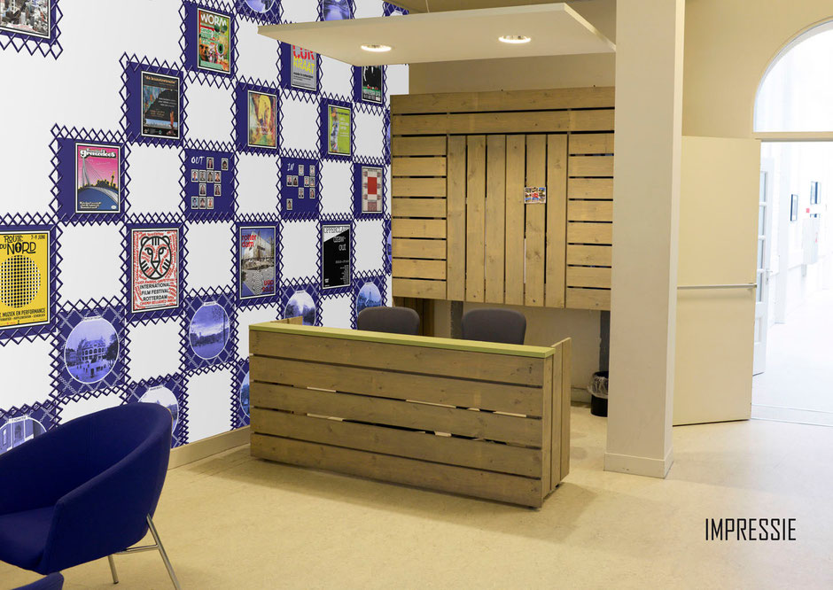
This design deals with different problems the community center was dealing with. Firstly there’s an acoustic problem. It’s a practical problem. The sounds are reflected in the entrance area. The former design didn’t manage to control these unwelcome reflections.
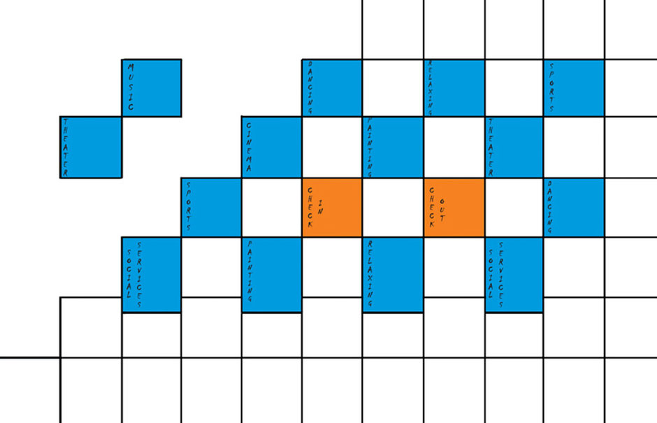
Another problem the owner was facing has to do with the many voluntary organizations which work in the building. There was a loss of control: how’s working when, where and more importantly who is who.
Furthermore there was a growing amount of posters and flyers being displayed all over the entrance. It was definitely too much. It created a chaotic impression.
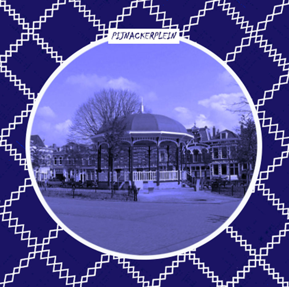
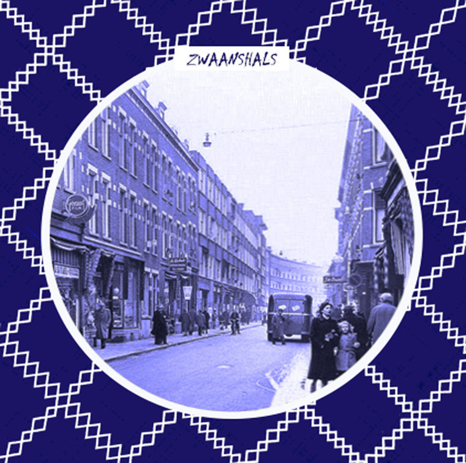
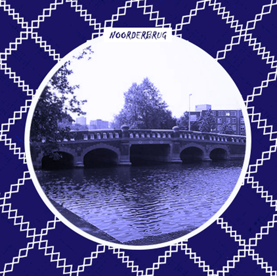
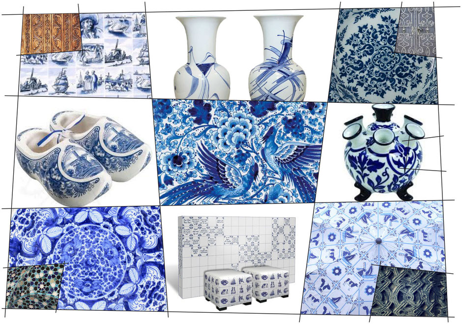
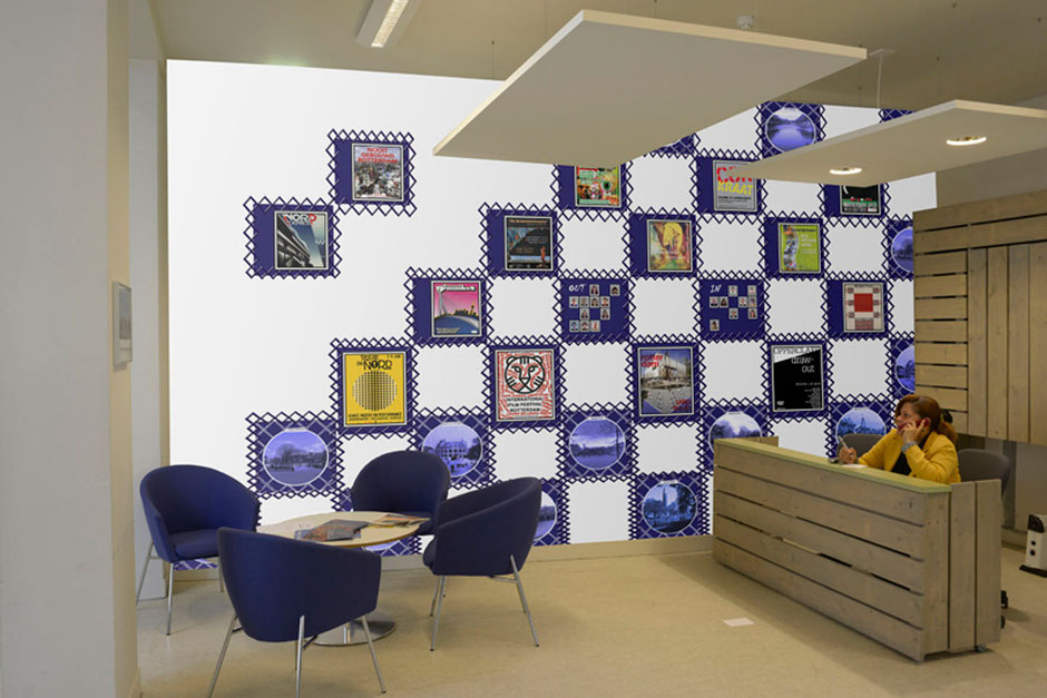
The basis of the design is a grid of squares on the left wall of the entrance. This wall is not being used although it’s one of the most central walls of the building. To make a historical reference which suits the interior of the building we chose the Delft blue tiles. These tiles were used as tiles to decorate your walls, but here they are in a new suit. The central tiles on the walls are used for announcements and to show who’s working in the building and the moment when you enter the building. The tiles on the top, bottom and side are decorated with historical important views and building in the neighborhood, thus referring to the function of the building as it is now: a community center.
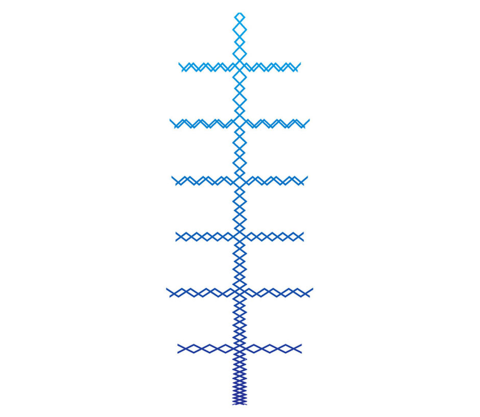
The grid has some nice details, for instance the pattern to make the grid consist of crossed lines, dense at the bottom – referring to our earthly existence – and more open towards the ceiling – referring to the light of heaven.
The design dealt with the acoustic problem by using printed floor carpet at the wall. This carpet absorbs a lot of sound. This way the room will be a nicer place to stay. In order to know which volunteers are present in the building we incorporated 2 panels in the wall with photoprinted magnets on metal panels. When you’re in you can put you picture on the metal board. Easy is the trick.To get rid of the chaotic impression with all these flyers and posters we introduced an ordered way to show what’s happening in the neighborhood. Effective aluminium A2 frames are incorporated in the design.